Data science and ML
Volve Field Analysis.
An interactive reservoir diagnostics dashboard built on Equinor's open Volve dataset: 15,634 daily production records across 7 wellbores, from September 2007 to December 2016.
Live on StreamlitCan take 30 seconds to wakeEquinor open data
Oil rate
8,609Sm³/d
Water cut
84.5%
Voidage replacement ratio
1.10
Avg reservoir pressure
254bar
// Equinor's open data, 2007 to 2016
- Dataset
- Equinor Volve15,634 daily records from 7 wellbores
- Built with
- Python, Pandas, NumPy, Plotly and Streamlit
- Period
- 2007 to 2016September 2007 to December 2016
- Status
- Live dashboardStreamlit Community Cloud
Why it exists
Daily well data
an engineer can question.
Equinor released the Volve field's production data to the public. I set out to turn its daily well measurements into a diagnostics platform a reservoir engineer could interrogate: when the water front arrived, whether injection kept pace with voidage, which wells carried the field, and how injectors and producers communicate underground.
Notebook first
It began as an exploratory Jupyter analysis in Matplotlib and Seaborn, then was rebuilt as a Streamlit app with Plotly so every figure became interactive.
Down to a single well
Date ranges, daily or monthly views, per-well deep dives and cross-well comparison take you from the whole field down to one well.
A read beside each section
Each section pairs its figures with a written reservoir-engineering interpretation, from VRR against its 1.0 target to what a flat GOR says about pressure.
Inside the dashboard
Three questions
the data answers.
// 01
The water front
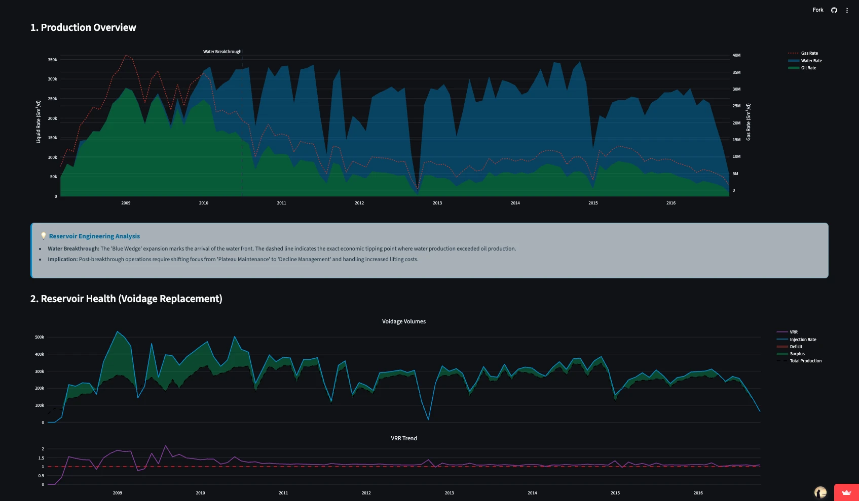
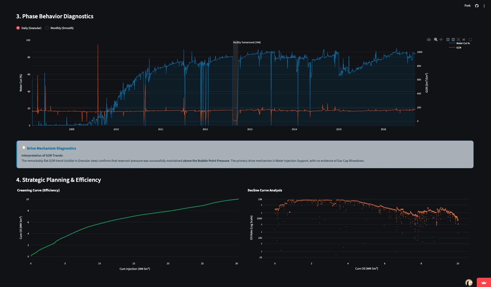
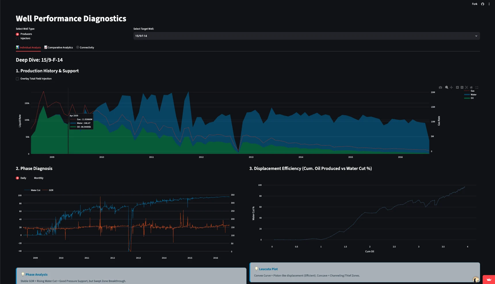
Water breakthrough is flagged by the data itself, on the first date water production exceeds oil, and water cut climbs from there to past 80 percent. The gas-oil ratio stays flat through all of it, so pressure held above the bubble point, with water injection driving the field and no sign of gas cap blowdown.
// 02
The wells that carried it
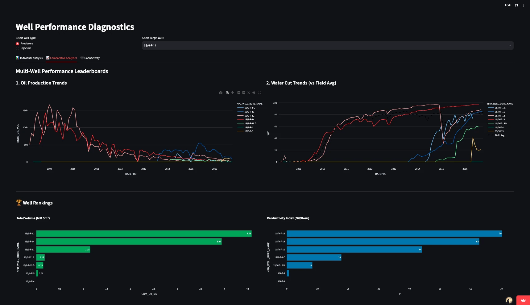
Leaderboards rank the producers by total oil and by productivity, with each well's water cut set against the field average. Any producer opens into a deep dive, where a Leucuta displacement plot separates piston-like sweep from channelling.
// 03
Injectors to producers
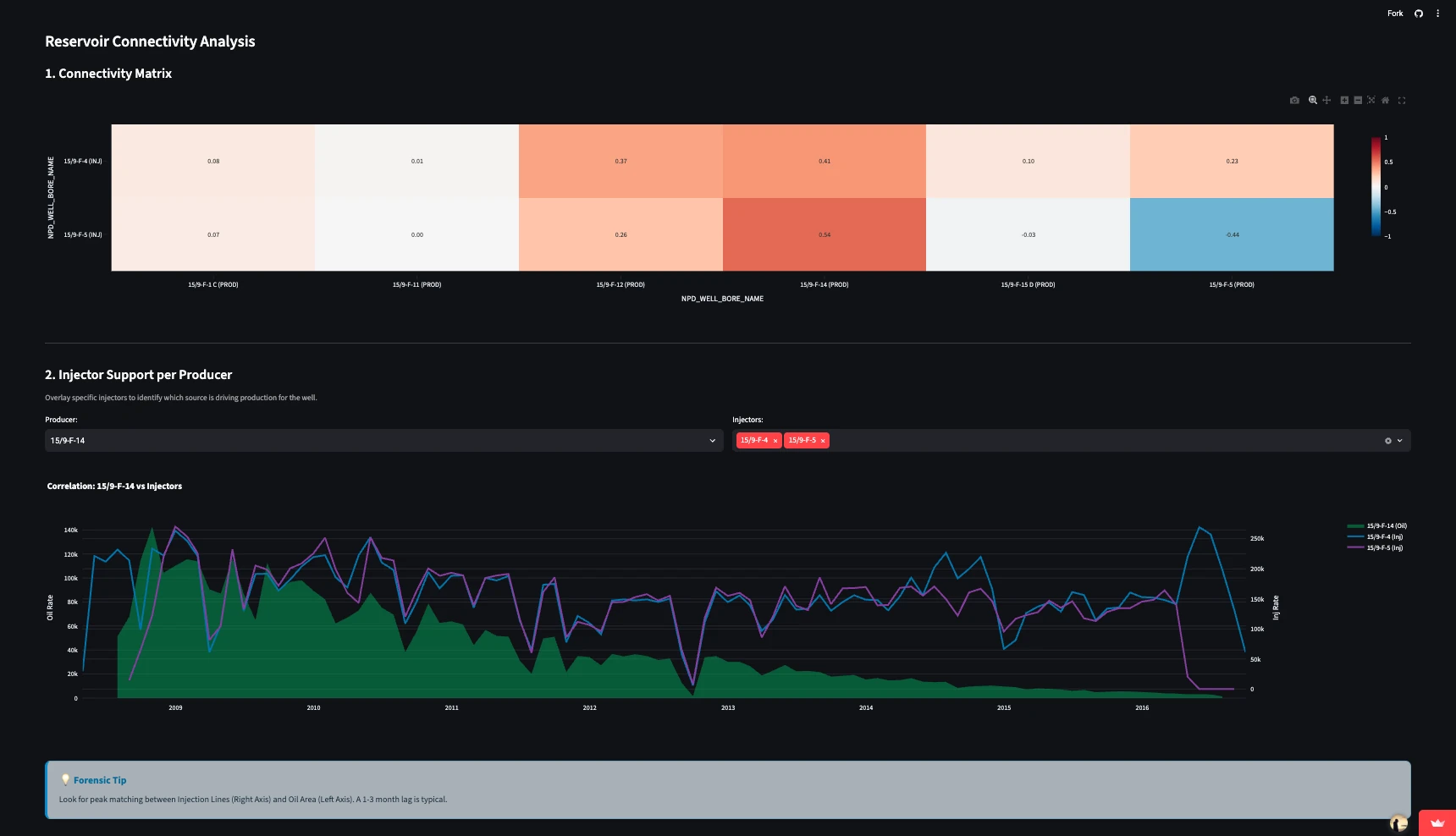
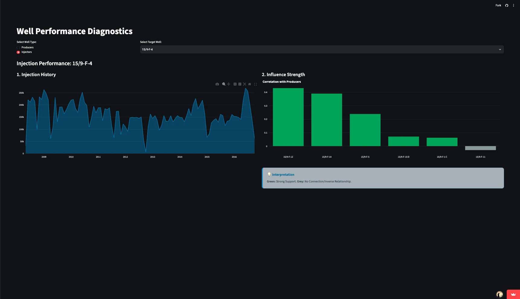
A correlation matrix links every injector to every producer, and overlays let you match injection peaks against a well's oil, allowing for the lag of one to three months the dashboard expects. From the other side, injector 15/9-F-4 correlates most strongly with producers 15/9-F-12 and 15/9-F-14.
Open the
dashboard.
It runs on Streamlit Community Cloud, which puts the app to sleep when nobody is using it, so the first load can take around 30 seconds.
Data: Equinor's Volve open dataset